Project Details
Categories:
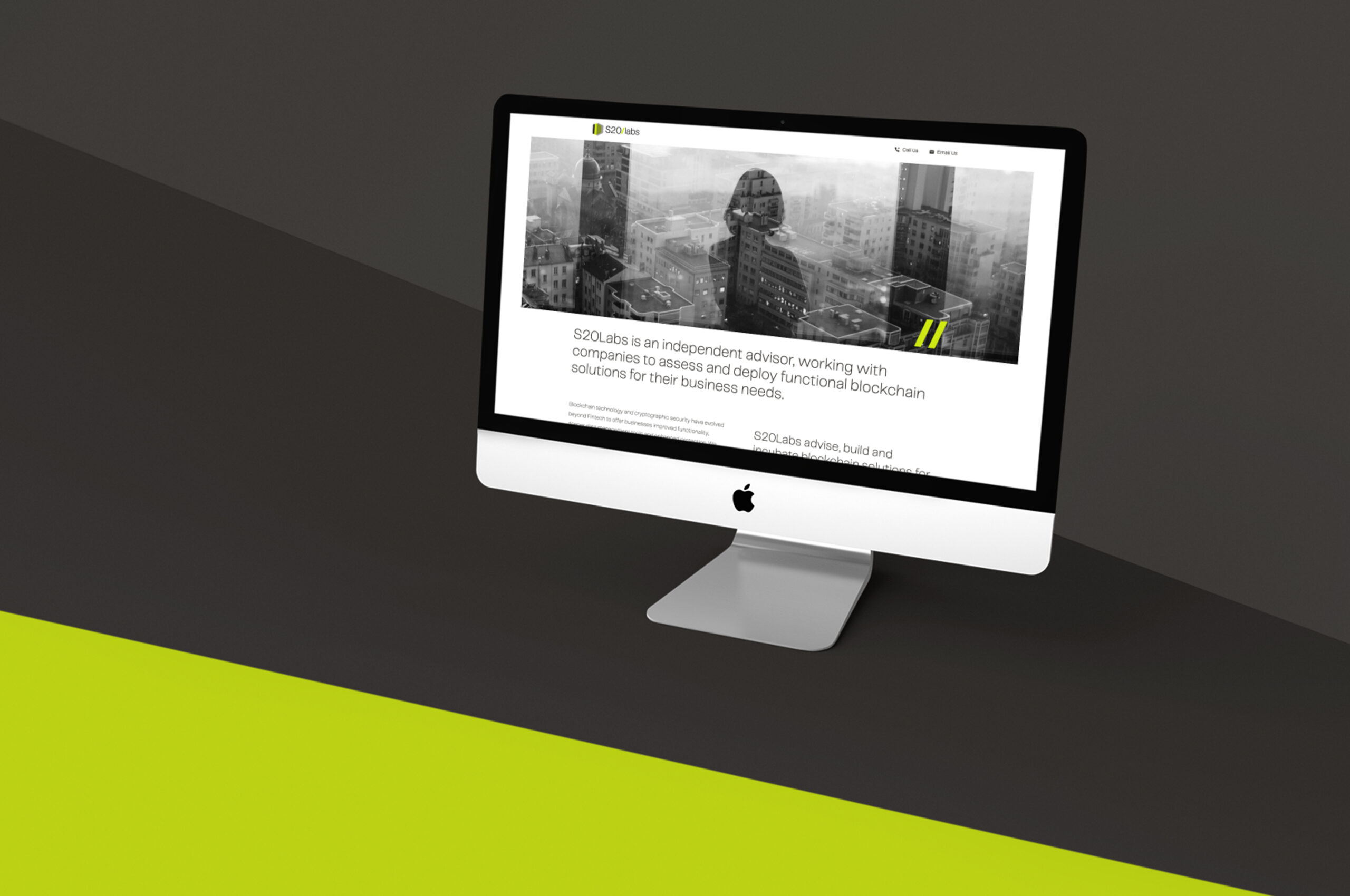
S20Labs engaged Swarm to craft a visual identity and web platform capable of showcasing their highly technical blockchain services with clarity and confidence. Recognising that blockchain’s underlying architecture—distributed ledgers, smart contracts, consensus algorithms—is nearly impossible to depict literally, we centred the design around typography and layout. The core text colour establishes a strong, legible foundation, while strategic accents in the signature lime green —most notably, the forward slash in the logo lock-up—punctuate calls to action and key headings without overwhelming the user.
To complement the typographic focus, we incorporated abstract, metaphorical imagery, including silhouettes and “overlook” compositions, that evoke the advisory and custodial roles S20Labs plays for its clients. These images serve as visual signposts, reinforcing trust and expertise while remaining open to interpretation. Given the depth and density of technical content—from whitepapers to API documentation—we broke pages into clearly defined sections, using generous whitespace, modular content blocks, and consistent heading hierarchies to guide readers through complex material in easily digestible increments.

Using the Telegraf font in Light/Regular and Bold formats, this has visually lifted the site from a base information point to a much more sophisticated, professional delivery of the same content.
Using the Telegraf font in Light/Regular and Bold formats, this has visually lifted the site from a base information point to a much more sophisticated, professional delivery of the same content.